Five years ago, I wrote about using Google Fusion Tables to create your own maps. Unfortunately, Fusion Tables will be “turned down” (isn’t that a pleasant euphemism for something that’s going to simply stop working?) on December 3 of this year.
But there’s another option
Fortunately, there is still a relatively easy way to create a map of locations for those of us who aren’t skilled Geographic Information System (GIS) users.
Google offers My Maps, which works much like Fusion Tables by letting you import a list of addresses and populating pins on a Google Map for each address. Follow along to see how easy it is to create a map…
Let’s create a map
Start by creating a CSV (comma-separated values) file or an Excel spreadsheet (it must be an .XLSX file) with the data to be imported and mapped.
In a real-world scenario, you might want to map meter reading routes or all the accounts on the cut-off list. For this example, I didn’t want to compromise a customer’s actual data, so I chose data that is readily available on the internet. I bank with Bank of America and know they have a list of banking locations on their website. I harvested the location data from the bank’s website, and using some of the data manipulation tools I wrote about recently, I converted the data into a pipe-delimited text file:
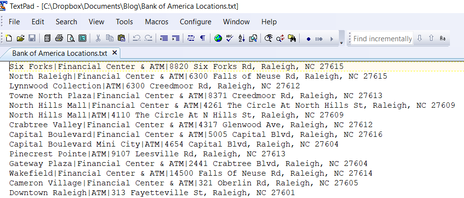
I then opened this file in Excel and added column headings, which are required by My Maps:
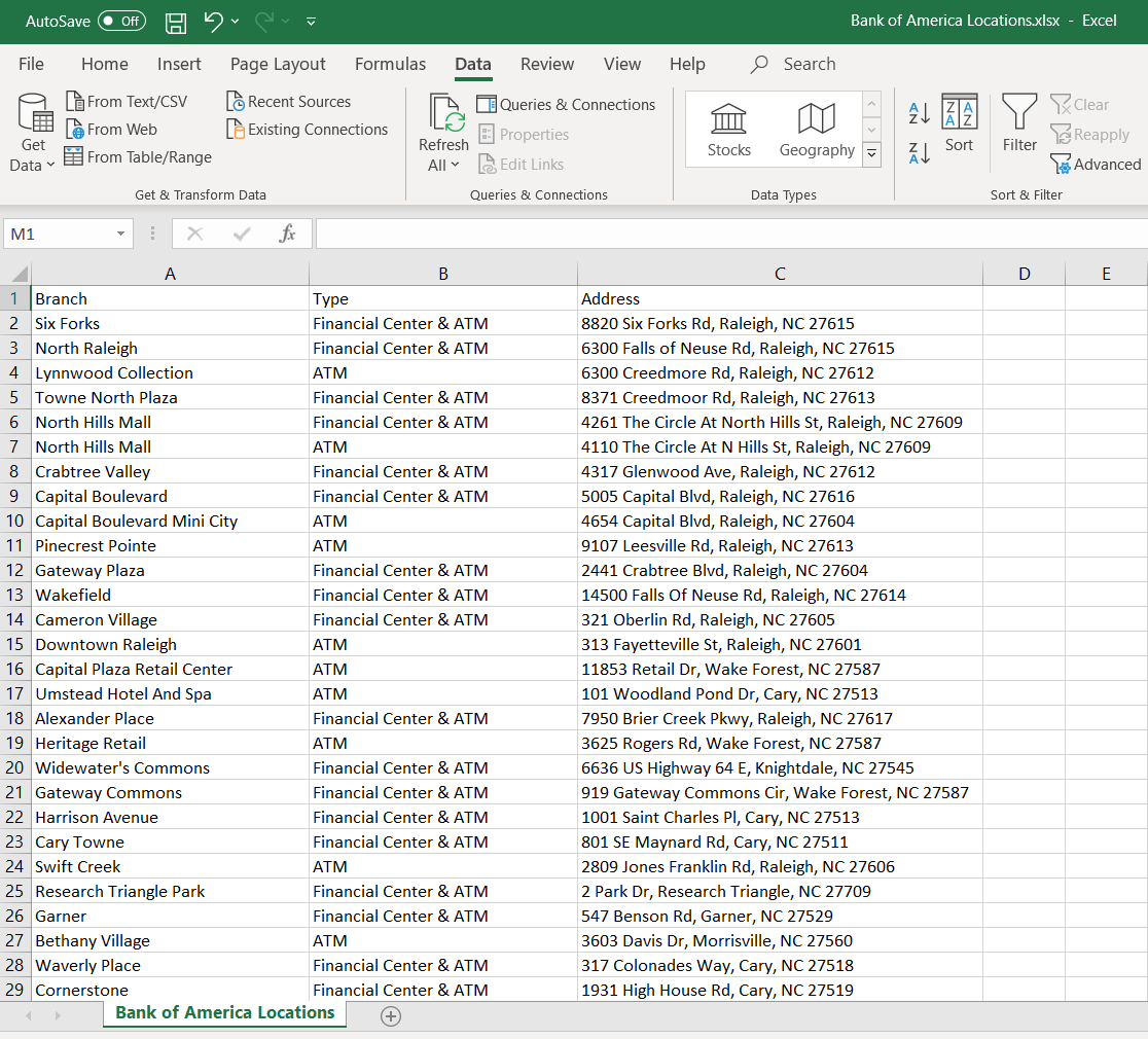
Your file can have the full address in one column (as this file does), or it can have separate columns for Address, City, State, and ZIP Code. In order to show an address error for example purposes, I changed the address for Lynnwood Collection to a PO Box.
Now we’re ready to import the file and create your map. Start by going to Google My Maps – https://www.google.com/mymaps.
Click on CREATE A NEW MAP.

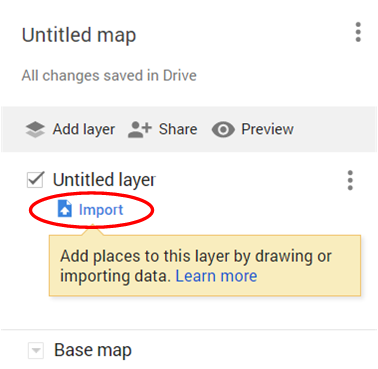
Click on Import.
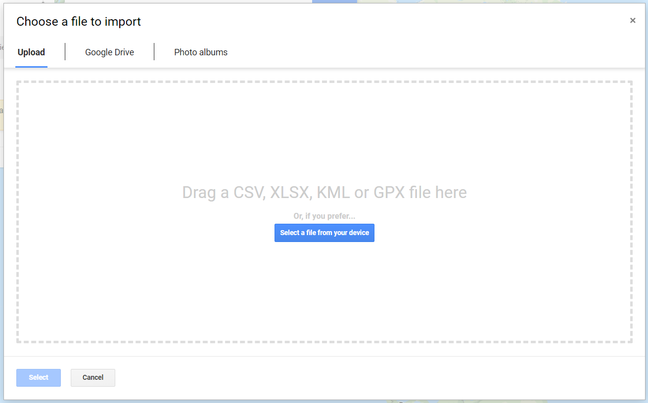
Drag your Excel spreadsheet or CSV file to the window or click on “Select a file from your device” to import your file with addresses to be mapped:
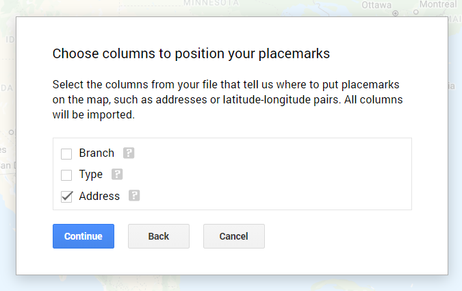
Click the column (or columns) containing the address. This is what My Maps will use to locate the placemarks on the map:
Choose a column to identify the title of the markers on the map. In a real-world scenario, this might be the service address or name of the account. For my example, this is the bank branch name:
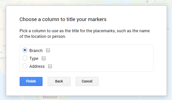
Now, click Finish and My Maps will create your map.
Once the file is imported and the map created, if you have any bad addresses (for example, PO Boxes) that can’t be mapped, this message will be displayed:
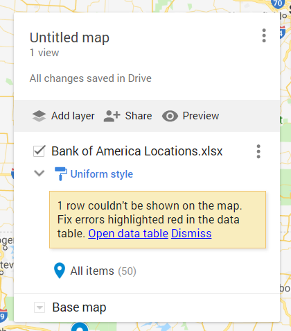
Click on “Open data table” to correct the addresses. A grid will be displayed:
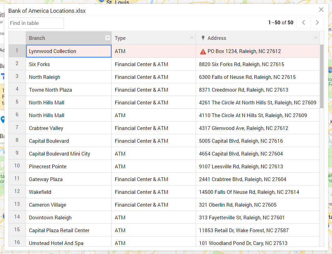
The addresses with errors will be listed at the top of the data table. You can correct the error right in the data table, without having to fix your original input file and begin the process all over again.
By default, My Maps will draw the map with all the markers having the same color:
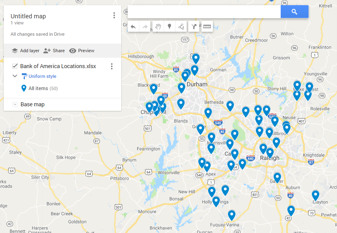
However, you might want to see different color pins on the map for different addresses. For example, different colors based on the services provided, or to distinguish between manual and radio read meters on a meter reading route. In my example, I want to be able to visually see the difference between full-service banks and ATM-only locations.
To do this, click on the Uniform style hyperlink:
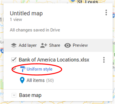
From the window that pops up, change Uniform style to the field in the data you want to use to determine the color of the marker. In my sample data, this is the Type field:
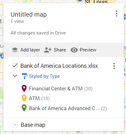
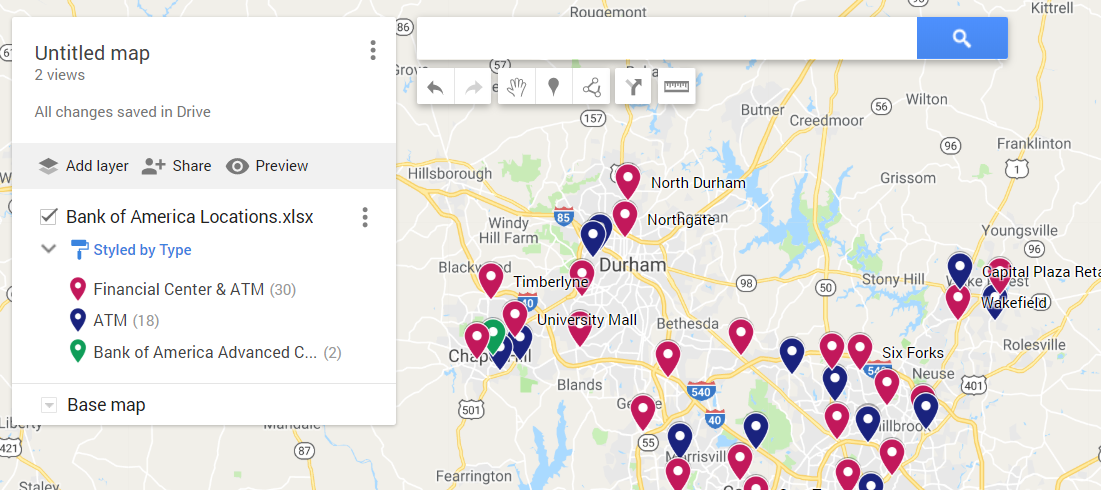
Google will randomly assign the colors of the map pins, based on the criteria you specified. If you want to change the colors, click on one of them, then click on the paint bucket icon at the bottom of the window and select your desired color:
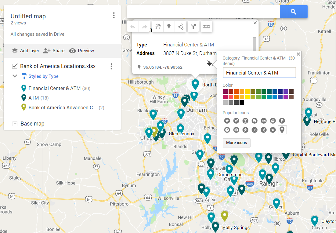
I chose purple for full-service banking centers, blue for ATM-only locations, and green for Bank of America Advanced Center, whatever that is!
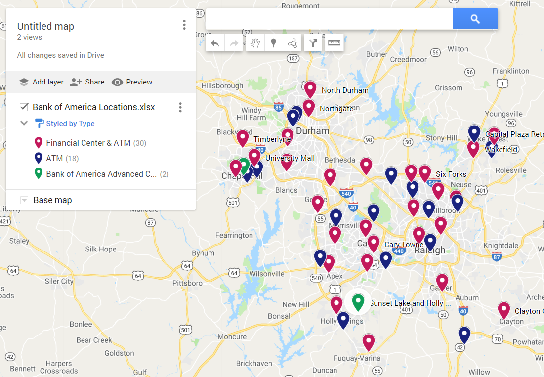
Congratulations, you’ve created your map!
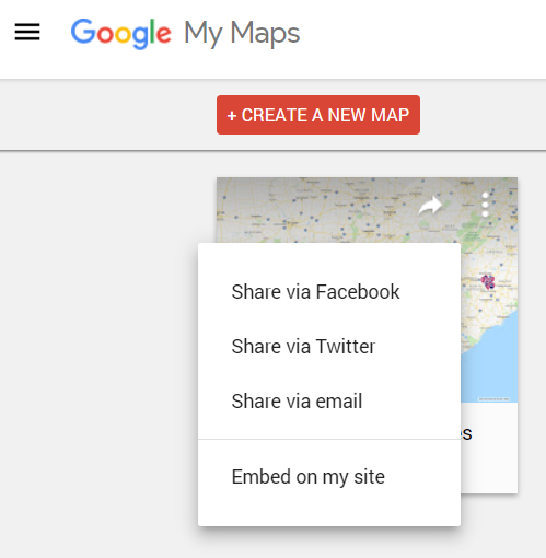
Now, if you want to share your map with others, you can do so by clicking the share button for your map:
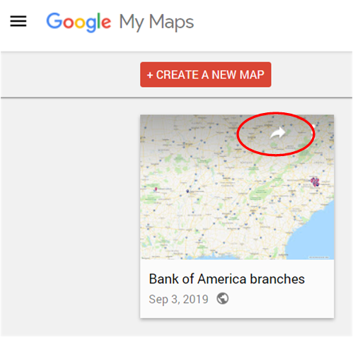
Then select the method you want to use to share the map:
